Table of Contents
Creating Stunning Visual Presentations: Design Tips and Tools

How do you design presentations that have stunning visual appeal? You need to use a combination of engaging content, effective design principles, and appropriate tools. It is also important to understand the needs and preferences of your audience so you can customize your presentation accordingly.
Create clean, uncluttered slide designs
One of the first design tips you need to know is how to make slides look good. Overcrowding slides with too much text or graphics is confusing. Visual clutter will detract from your message. If you learn how to use white space effectively, it enhances readability. Try using the 6 x 6 rule, which means a maximum of six bullet points per slide and six words per bullet.
Microsoft PowerPoint is probably the most commonly used presentation software. It offers many different design options and templates to help you create visually appealing slides.
As a student, you may find you have too many assignments to work on in your design presentation. You can use AssignmentBro writing services and get the help of expert writers in various academic fields. The prices you pay for assignments are affordable, and there’s no compromise on quality. When getting an assignment online, you can talk to the writer, ask questions and make revisions. You can submit your assignment on the due date and have time to prepare your presentation.
Choose effective typography
Fonts have different personalities and emotional impacts. For presentation inspiration, you need to choose fonts that match the tone and purpose.
- Choose fonts that are legible and appropriate for your content. Sans-serif fonts like Verdana and Tahoma are easier to read on slides than serif fonts.
- Stick to a limited number of font styles to maintain consistency. You only really need to use one or two fonts. Using too many fonts is distracting.
- Ensure that the text is large enough to be read from a distance. In most cases, it should be at least 30 pt.
- Font sizes can help to create a visual hierarchy that guides a viewer’s attention. For example, they can help to distinguish headlines from body text.
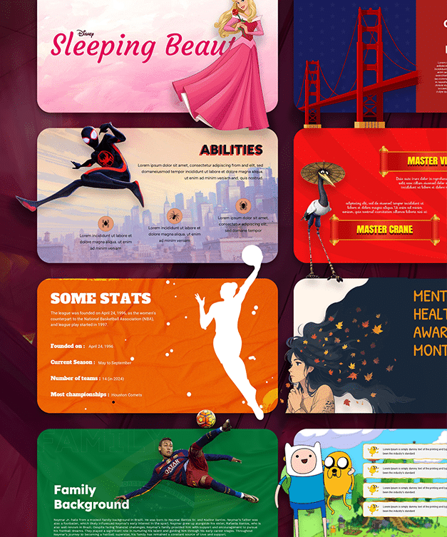
Canva is a versatile online graphic design website. It provides a great variety of customizable templates. There are many fonts available to help you create visually stunning presentations. There are also tutorials that can help you to learn which fonts work effectively together.
Use high-quality visuals
Images, graphics, and charts must be high-resolution and relevant to your content. Today there are many online sites where you can find free, high-resolution images with visual impact. Some of these sites are Pixabay, Unsplash, and Flickr.
You will need to use search terms relevant to your message to find the best supporting images for information presentations. The images should be convincingly realistic and inspirational. Try to colour-coordinate your visuals with the color scheme you choose for your slide deck. You can also create your own visuals by teaching yourself to use programs like Adobe Photoshop.
Keep colors simple
Stick to simple light and dark colors for your presentation. If the text is too bright it causes eye fatigue. Dark text on a light background works well. It’s best to avoid using gradients as they can draw attention away from your message.
The colors you use can set the mood and showcase your priorities. A slide that uses the right colors has an immediate impact on the audience. A study called Exciting Red and Competent Blue helps to demonstrate this. A class in color theory can help you to use your color palette to influence emotion.
Incorporate multimedia elements
Elements like videos, animations, and audio clips can convey complex ideas more effectively and enhance engagement. SlideChef’s Free Animated Templates library offers some amazing animated templates
Keynote is presentation software by Apple designed for macOS and iOS devices. It offers professional templates, advanced animations, and multimedia integration.
Use narrative format
Structuring a presentation in a narrative format with a clear introduction, body, and conclusion will also improve engagement. You can tell a story that flows logically from point to point. This will make the content more meaningful and humans are hard-wired to listen to stories. Ensure that you choose a story that’s relevant to the point you want to make and tailor it to your audience.
Maintain consistency
It’s important to maintain a consistent design throughout your presentation. This includes using a cohesive color palette, fonts, and formatting. The impact on your audience will be more professional. Your conclusion slide should reinforce your message and leave the audience with a clear and lasting impression.
Conclusion
You may have to create a presentation as part of your education or for work purposes. If you want to create stunning visual presentations, you have to think carefully about what tools you can use. You also need to understand effective design principles to achieve the most engagement.
About The Author