Step-by-Step Guide to Make Columns in Google Slides – Simple Steps Using AI

Simple Guide to Create Columns in Google Slides
Today Google Slides presentation is one of the most widely used presentation tool. Because of its wide range of features and flexibility.
Google Slides offers collaboration, accessibility, integration, customization, presentation features, and cost-effectiveness, making it a great choice for creating and sharing presentations. While many are familiar with its basic features, but still its potential for creating visually engaging and informative content often remains untapped.
New users and even professionals often finds it difficult to add specific elements like columns, rows, tables, charts. Adding charts, text box, columns and rows helps you to organize your content, that can significantly enhance the clarity and impact of a presentation. Got bored and feel frustrated creating presentation on own. Then look at best AI presentation makers, that can make presentation creation super-easy
But adding variety of features to enhance your presentation can be tricky and also can be a source of frustration if isn’t done with proper guidance. But don’t worry, SlideChef presentation experts can help you out in unlocking the full potential of Google Slides.
In this expert guide, we’ll walk through the step-by-step process to add columns in Google Slides and other essential elements, ensuring your presentations are not only informative but also visually appealing and easy to understand.
How to Make Columns in Google Slides
There are different methods to add columns in google slides, so lets get started with the simplest ways. Follow these steps
Method 1 – Using Tables
- Open the Slide where you want to add rows and columns
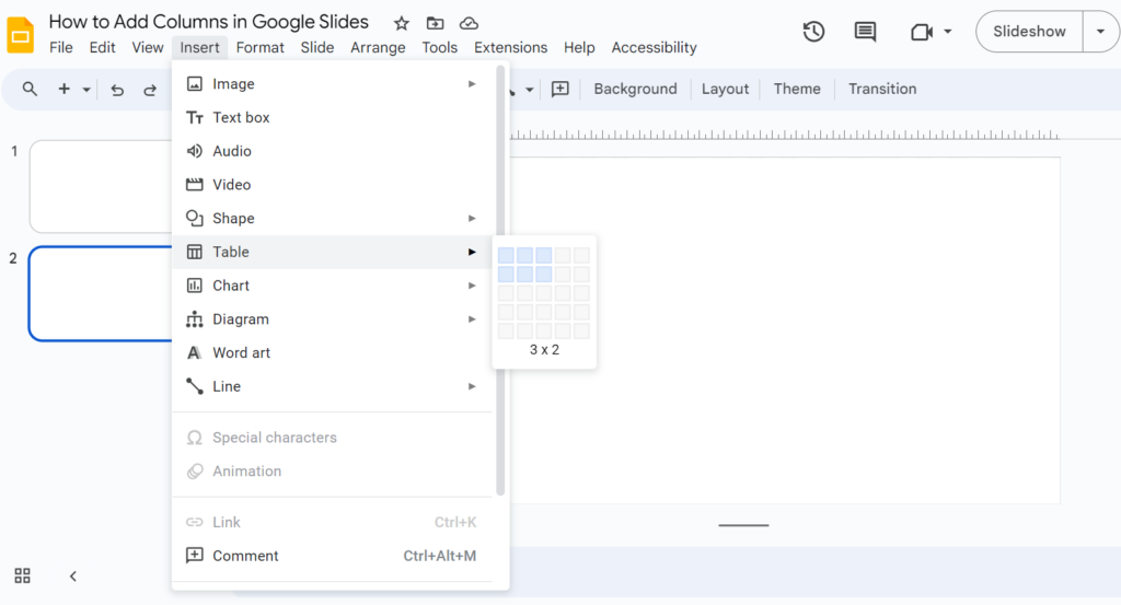
- Click on the ”INSERT” menu at the top.
- Now select ”TABLE”, a box will appear, hover the mouse over it and select the desired number of columns and rows. (Add number of columns by selecting the boxes)
- A table will appear on the slide.
Adjust Width of the Columns
- Hover your mouse over the vertical line between columns.
- Click and drag to adjust the width of the columns.
Method 2 – Adding Two Columns in Google Slides (Text Box)
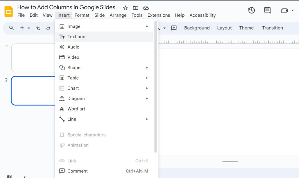
- Click the “INSERT” menu and select “TEXT BOX”
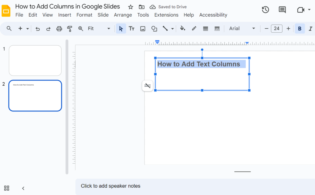
- Draw text boxes on your slide.
- Drag and drop the text boxes to position them side by side.
- Adjust the width and height of the text boxes as needed.
- Type text or insert images into each text box.
Add a Table Columns in Google Slides
Tables in Google Slides are perfect way to add effectiveness in your data representation. Add table columns in Google Slides to create lists, compare and contrast information, show relationships between data points, and even display complex datasets. Tables are particularly useful for presenting numerical data, such as statistics, budgets, or survey results. By using tables, you can make your presentations more visually appealing, easier to understand, and more professional.
- Open the slide where you want to add the table
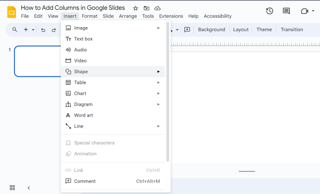
- From the top menu click ”INSERT”.
- Now from the drop down menu select ”TABLE”. A boxes grid will appear.
- Then select the number of columns. (Hover your mouse over the grid of squares to select the desired number of columns you want).
How to Customize the table in Google Slides
Once the table is inserted, you can customize it by:
- Adjusting column width: Hover over the vertical line between text columns and drag to resize.
- Adjusting row height: Hover over the horizontal line between rows and drag to resize.
- Adding or removing rows/columns: Right-click on a cell and select “Insert row” or “Insert column.”
- Formatting cells: Change font, color, alignment, and more by selecting cells and using the formatting tools.
Step-by-Step Guide to Create Presentation with Charts
Charts are a powerful tool for visualizing data and making your presentations more engaging.
But finding the perfect chart diagram that suit your presentation can be tricky.
Google Slides offers a variety of chart types, including bar charts, line charts, pie charts, and scatter plots.
By adding charts to your slides, you can effectively communicate complex information, highlight trends, and make your presentations more visually appealing.
Adding Charts in Google Slides Presentation
- Choose the slide where you want to insert the chart.
- Click on the “INSERT” button at the top of the Google Slides menu bar.
- In the drop-down menu, choose the “Chart” option. You get 4 options – Bar, Column, Line, Pie.
- Select the type of chart that best suits your data.
- If you’re creating a new chart, enter your data directly into the table that appears.
- If you already have your data in a Google Sheet, you can link the chart to that sheet.
Customize Charts in Google Slides
- Changing the chart type: Right-click on the chart and select “Change chart type.”
- Adjusting the axis labels: Click on the axis labels and edit the text.
- Adding a title: Click on the chart title and enter your desired text.
- Changing the colors: Select the chart elements and choose different colors from the palette.
- Adding data labels: Click on the chart and select “Add data labels.”
Conclusion
Adding columns to your Google Slides presentations is a powerful way to improve organization, readability, and visual appeal. By following guide to make columns in Google Slides, you can easily create effective column layouts that enhance your content and make a lasting impression on your audience.
About The Author