How to Create a Captivating Title Slide for Your Student Presentation?

A big part of being a student is presenting your projects to professors and fellow students. This can be a challenge for most as it often involves standing in front of classmates, and grades are often attached. However, student presentations can be pretty easy, especially if you prepare for them.
The title slide is one of the first and most challenging things to consider when working on your presentation. A nice title slide will captivate your audience, and the initial positive feedback you get can boost your confidence until the end. So, to take your presentation skills to the next level, consider reading this article.
Preparing a Captivating Title Slide
Students often write reports as part of their academic responsibilities. While this can seem like a chore sometimes, it has many positive effects on your grades and skillset. Besides writing reports, you will often need to present them to academic peers and supervisors. If this will be your first time doing a student presentation or you are looking to get better at it, here are six tips that will help:
- Choose A Template
- Create Your Design
- Do Not Overcrowd The Slide
- Consider Colorblindness
- Include A Relatable And Inspiring Quote
- Use a Moving Image.
1. Choose a Template
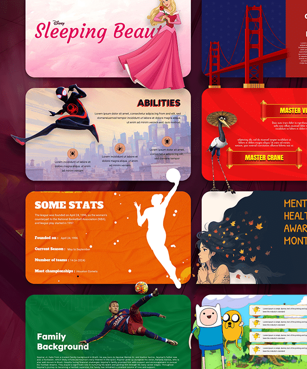
When designing a nice title slide, feel free to get inspiration from the works of others. PowerPoint has hundreds of free templates you can download within the application. These templates can look very different, so you might need to take some time searching for the right one.
A presentation is the type of project many students get. Medical students have many tasks like that, and they can be extra hard to do good if English is not your first language. If this is the case, you can get medical translation services online and ensure that your presentation does not have any mistakes and other issues. This is important, as when the information is presented on a larger scale, it’s easier to spot mistakes, which will bring down your grade and put a damper on the hard work you have done.
2. Create Your Design
Once you have a template, you can modify it to suit your taste. Typically, you won’t have to do too much work modifying your design. You should consider the text and image visibility when creating and modifying your design. Some of the modifications include changing the color of the design, the size of the text box, and much more.
3. Do Not Overcrowd the Slide
When creating your design for your title slide, you might be tempted to include as much information as possible. However, this shouldn’t be the case. Instead, you should do your best to limit text to one line or two max. Summarizing your thoughts into a couple sentences can be difficult, but you can always get an experienced writer to help you by reading through LetsGradeIt free online reviews. Each of their reviews has been written without any bias. Also, they teach you how to spot good essay-writing companies, so there’s much to learn by visiting the website.
4. Consider Color Blindness
This is often overlooked, but color blindness is definitely something you should keep in mind when working on your presentation. In simple terms, color blindness involves the inability to distinguish between shades of red and green. It’s often hereditary and has no treatment except when caused by some other underlying issue. So, make sure to consider color blindness to ensure all members of your presentation can appreciate the full content. To aid with visibility, use larger and more contrasting fonts.
5. Include a Relatable and Inspiring Quote
Regarding your title slide’s content, you can start with a simple and relatable quote. The aim is to capture your audience’s attention early in your presentation. You can also go for some interesting facts related to what you’ll be presenting. It’s important to note that some student presentations have strict rules behind them, so make sure to consider that when creating your title slide. Suppose there are no rules regarding how the content of your slides is made. In that case, you could fully express your creativity and design a memorable first slide to entice your audience and make your presentation more memorable.
6. Use a Moving Image
Lastly, another creative idea for a title slide is to use a GIF or even a short video. A moving image will draw more attention to your title slide and distinguish your work from the projects of your fellow classmates. Of course, you should ensure that your chosen image is appropriate and matches the topic of your presentation.
7. Use an Attractive Thank You Slide
Creating an appealing title slide isn’t enough for a winning presentation. You need to thank your audience at the end of the presentation for their time and patience. So they feel valued and welcome. I do recommend SlideChef’s Free Thank You Slides library for an amazing collection of thank you templates.

In Conclusion
Creating captivating title slides is a big part of a successful presentation. For students, a successful presentation can mean a good grade or an internship opportunity. Hence, this skill must be learned. Hopefully, this article has taught you a thing or two regarding creating captivating student presentations.
Author’s Bio
Mark Wooten is a freelance writer and graphics designer. As a freelancer, Mark has learned to be captivating with his content in the least amount of time. Learning this was a challenge initially, so now he is passionate about helping others. When Mark isn’t working, you will find him playing soccer with friends.


