Table of Contents
Secret Tips and Tricks on How to Make Google Slides Presentations Look Good
Master guide on how to make Google Slides look good
You would admit, we’ve all been there: sitting through a mind-numbingly boring presentation, fighting the urge to yawn or check our phones.
A lackluster presentation can quickly disengage an audience, leaving the presenter feeling deflated and demotivated. But fear not!
With our master guide learn how to make Google Slides presentation look good.
Moreover you can transform your presentations from dull to dynamic, captivating your audience and leaving them wanting more.
Simple Tips and Tricks to Make Your Google Slides Look Cool
Elevate your Google Slides presentation and build your brand value with these simple hacks. Here in the blog you will discover innovative techniques for making your Google Slides presentation a captivating experiences to keep your audience engaged.
From incorporating interactive design elements to utilizing effective visual storytelling or using color theory or just making presentation design tweaks, these expert tips will help you create presentations that will win audience’s attention.
1. Tailor Your Layouts for Impact:
While Google Slides offers pre-designed layouts, customizing them to match your unique presentation style can make a significant difference and make it more engaging. Adjust elements like fonts, colors, adjust size and transparency and spacing to create a cohesive and visually appealing experience for your audience.
2. Choose Backgrounds Wisely:
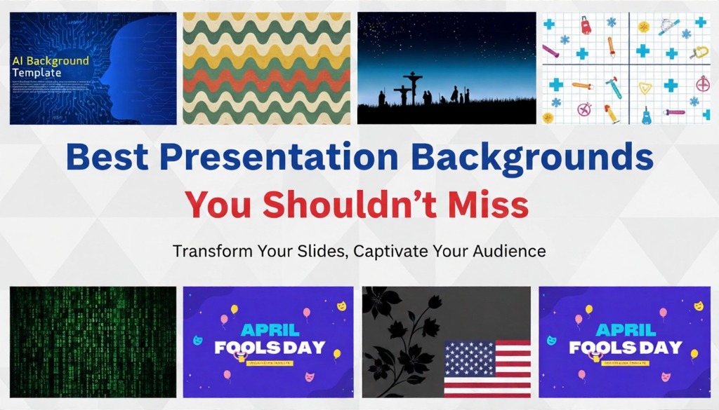
Backgrounds play a critical role in setting the tone and atmosphere of your Google Slides presentation. A well-chosen background can enhance your message and create a visually appealing experience.
- Contextual Backgrounds: Select backgrounds that complement your content. For example, selecting a nature-themed background would be appropriate for a presentation on environmental sustainability.
- Subtlety: Opt for subtle or transparent backgrounds that support your text without overpowering it. Avoid overly busy or distracting backgrounds that can detract from your content and make the text unreadable.
3. Leverage Dark Backgrounds for Attention:
Dark backgrounds can create a more dramatic and engaging atmosphere that make your presentation look more intense and dynamic. However, make your text readable and graphics are visible against the dark backdrop.
Master Tip: Consider using lighter or contrasting colors for text and elements to maintain visibility.
4. Embrace the Power of Black and White:
You will agree black & white is the most sophisticated color scheme to use. Adding a Black and white theme slide design make your presentation look classy and professional. While it may seem minimalist, but it can also be highly effective in highlighting key points, creating a strong visual impact.
5. Master the Master Slides Tool:
Time is money, to save time and ensure consistency throughout your presentation, use Google slides, Master Slides tool.
When using the Master slides tool, just customize the master slide and changes are automatically applied all across your slides in your presentation. This is particularly helpful for modifying backgrounds, rearranging placeholders, or changing the overall theme.
So you don’t have to make changes slide to slide, saving presenters time and efforts.
6. Prioritize Simplicity and Clarity:
Avoid bombarding your audience with text heavy images, bright or glittery colors. Always make your slides look clean and uncluttered to ensure that your message is delivered effectively. Focus on highlighting key points and using visuals to support your content.
Making Your Google Slides Presentation Look Amazing With Images
Images speaks louder then words, adding images can significantly enhance the appeal of your Google Slides which grab the attention of your audience.
By incorporating relevant and high-quality images, you can break up large blocks of text and make it easy to read, illustrate complex concepts, can explain lot of information in short and concise way and capture your audience’s attention.
Key Considerations for Using Images in Presentations
- Relevance: Ensure images directly relate to your content and support your key points. Select images based on the presentation theme
- Quality: Use high-resolution images to avoid pixelation and maintain a professional appearance.
- Consistency: Use a consistent style and theme across the slides.
- Attribution: If using images from external sources, provide proper attribution to avoid copyright issues. Try to embed URL of the website from where images you might want to use.
- Accessibility: Consider the accessibility of your images, especially for individuals with visual impairments. Use descriptive alt text for all images.
Transform Your Images : Creative Hacks to Use Images in Google Slides
While making a presentation simply adding images won’t make them look good, moreover its isn’t enough to make them truly stand out. By employing these innovative techniques, you can elevate your visuals and create presentations that are both visually stunning and engaging.
Discover how to use images creatively to enhance your content and leave a lasting impression on your audience.
Using Shape Masks
Instead of using standard rectangular or square shapes, try using some creative style. Try shape masks to give your images a unique and eye-catching appearance. By applying different shapes to your images, you can create visually interesting and engaging compositions.
- Experiment with Shapes: Try using various shapes like circles, triangles, hearts, or custom-drawn shapes to transform your images.
- Crop and Mask: Crop your image to the desired size and then apply the shape mask from the cropping tool.
- Customization: Adjust the size and transparency, color, and border of the shape mask to further enhance the visual effect.
Seamlessly Integrate Web Images
- Direct Search: Oftentimes, the perfect image for your presentation may not be readily available in your personal library. That’s where the power of the internet comes into play. Google Slides makes it incredibly easy to integrate web images into your presentations with just a few clicks. Simply search for the desired image using Google’s search function within Slides, and easily add it to your slides, enhancing the visual appeal and relevance of your content.
- Relevance and Aesthetics: Choose images that are relevant to your content and enhance the overall aesthetic of your presentation. Moreover understand your audience and use images or photos that your audience might like.
- Copyright Considerations: Be mindful of copyright laws and ensure that you have the necessary permissions to use images from external sources.
By incorporating relevant and high-quality images, you can break up large blocks of text and make it easy to read, illustrate complex concepts, can explain lot of information in short and concise way and capture your audience’s attention.
Selecting Catchy Texts to Make Whole Presentation Look Amazing
The right text can make your Google Slides presentation stand out and capture your audience’s attention. By carefully selecting fonts, colors, and layout, you can create visually appealing and engaging slides.
Font Recommendations:
- Sans-serif fonts: Arial, Helvetica, Roboto, Open Sans, and Montserrat are popular choices for their clean and modern appearance.
- Serif fonts: Times New Roman, Georgia, Garamond, and Palatino are classic serif fonts that add a more formal and traditional feel.
- Handwritten fonts: Brush script, Pacifico, and Lobster are creative options for a more informal and personal touch.
- Sans-serif fonts: Arial, Helvetica, Roboto, Open Sans, and Montserrat are popular choices for their clean and modern appearance.
Importance of Fonts:
- Readability: Choose fonts that are easy to read and avoid overly decorative or complex fonts that can be difficult to decipher.
- Consistency: Maintain consistency in your font choices throughout the presentation to create a cohesive look.
- Visual Appeal: Fonts can significantly impact the overall visual appeal of your slides. Experiment with different fonts to find the best match for your content and style.
- Brand Identity: If your presentation is related to a specific brand, consider using fonts that align with the brand’s identity.
- Tone and Mood: Fonts can help convey the tone and mood of your presentation. For example, a playful font can create a more informal and fun atmosphere, while a more serious font can convey a professional and formal tone
Interactive Experiences: Make Your Google Slides Unforgettable
A static presentation can quickly lose the attention of your audience. By incorporating interactive elements in your presentations you can create a more engaging and memorable experience. Here are some effective ways to make your Google Slides presentations interactive:
- Use the Q&A Section at the end: Audience participation is key to presentation success. Encourage audience participation by enabling the Q&A tool. This allows attendees to ask questions in real time, fostering discussion and engagement.
- Incorporate Interactive Game Templates: Add a fun and engaging element to your presentation by using interactive game templates. These can include quizzes, polls, or interactive exercises.
- Utilize 3D Designs: Bring your content to life with 3D designs. This can be particularly effective for visualizing complex data or concepts.
- Embed Videos and GIFs: Enhance your presentation with videos and GIFs to break up text-heavy slides and add visual interest.
- Use Interactive Elements: Explore interactive elements like clickable buttons, drop-down menus, or sliders to create a more engaging experience.
- Leverage Google Forms: Create interactive forms to collect feedback, conduct surveys, or gather information from your audience.
- Integrate Social Media: Encourage audience participation by allowing them to share your presentation or engage with your content on social media.
The Power of Infographics: Enhance Your Google Slides Presentations Look Good
Infographics are powerful visual tools that can transform your into engaging and informative experiences. By incorporating infographics Google Slides Templates , you can simplify complex data, make your content more visually appealing, and enhance audience understanding.
Amazing Infographic that Can You Shouldn’t Miss
- Charts: Use charts to visualize data and trends, such as bar charts, line charts, pie charts, and scatter plots. Must to have infographic for professional presentations.
- Timelines: Illustrate sequences of events or processes with timelines, making it easier to understand the progression of information.
- Maps: Use maps to show geographical data, locations, or routes, providing a visual context for your content.
- Flowcharts: Visualize processes or workflows with flowcharts, guiding your audience through complex information.
- Infographics: Create custom infographics that combine various visual elements to tell a story or convey information in a visually appealing way.
By strategically incorporating infographics into your Google Slides presentations, you can make the presentation more engaging, memorable, and effective in conveying your message.
Use Google Slides Animations : For Engaging Presentation with Animations
Animations can add a dynamic and engaging element to your Google Slides and even PowerPoint presentation look more entertaining. By strategically incorporating animations, you can highlight key points, guide your audience’s attention, and create a more visually appealing experience. Animations can also help break up text-heavy slides and make your content more memorable.
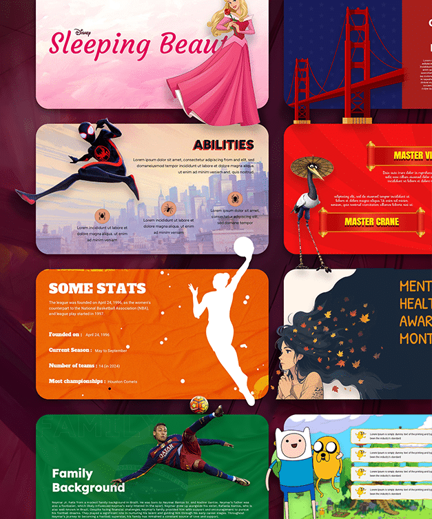
SlideChef’s Gigantic Library of Free Animation Templates
Designing animated templates can be time-consuming, but don’t free, SlideChef’s pre-made template with animations can instantly elevate the visual appeal of your presentations. With a wide range of animated effects and styles, you can easily find templates that match your content and brand color theme. These free animated templates can save you time and effort while ensuring that your presentations are visually stunning and engaging.
Final Words
By following this blog i guarantee, you can transform your Google Slides presentations into powerful and engaging experiences. Remember, the key to success lies in combining effective design principles with compelling content and a strong presentation. By following these steps, you can create presentations that captivate your audience, inform your message, and leave a lasting impression.


