Designing Visually Engaging App Presentations for Impact
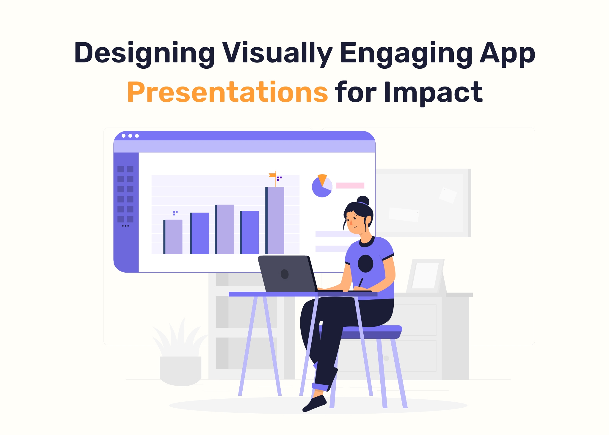
When you develop a business app, its presentation is far more than a perfunctory exercise. It is a vital point when design meets strategy, where user attention is not just sparked but also strategically maintained. The article goes into the delicate art of creating visually appealing app displays, clarifying their critical position in the user acquisition and retention story.
The Significance of Visual Engagement
In an age of information overload and short attention spans, the importance of visual engagement cannot be emphasized. It acts as an initial interaction, the transitory window through which users learn about the business app.
The power of first impressions
Recognizing the importance of first impressions, the presentation must function as a digital window, creating an immersive experience that connects with the user from the start. It is the virtual handshake, a key moment when the user decides whether to participate further or not.
Narrative over manual discourse
It is critical to go from technical explanation to narrative speech. Users are experienced consumers, and the presentation must tell a compelling tale that goes beyond the introductory. Instead of bombarding customers with technical language and requirements, weave a story that shows how your software blends smoothly into their life, solving pain points and improving experiences.
Visual primacy over textual overload
Recognizing that modern user behaviors are characterized by quick encounters, simplicity is essential. User engagement is maximized when information is kept brief and visual components are used selectively. Text walls are the enemy. To keep a user’s interest in a scroll-and-swipe era, break difficult material down into digestible bits and supplement with visuals — pictures, infographics, and possibly an interactive feature or two.
Recommendations for Memorable Presentations
Memorability is the greatest praise in the world of app presentations. The following guidelines, when implemented strategically, help to create a long-lasting digital footprint:
Brand Cohesion
Incorporate a seamless blend of brand elements — colors, logos, and identity markers — to provide a unified and identifiable brand character. Consistency is essential because it enhances brand memory and develops a visual language that consumers can easily identify with your business application.
User-Centric Design Paradigm
Adopting a user-centric design mindset is unavoidable. The presentation must communicate a visual language that demonstrates a deep awareness of the user’s needs and connects with their expectations. It’s about building an experience that corresponds with the user’s preferences and pain spots, not just looks.
Highlighting Key Features
It is critical to highlight what distinguishes the software by providing a brief yet complete summary of its functions. Users want to know how your business app can improve their lives, and the presentation should be a visual guide that walks them through the transformational experience that your app provides.
Integration of Social Proof
As a supporting layer, employ good user comments and recommendations. Creating trust through social evidence is a powerful component of the presenting approach. It’s not just about what you say, but also about what others say. If your business app has gotten praise, favorable reviews, or testimonials, include them carefully into your presentation to boost credibility and create trust in potential users.
Key Elements of a Presentation
A table describing essential design components necessary for generating an engaging presentation is provided below:
| Element | Description |
| Visual Consistency | Maintain a consistent visual style throughout the presentation. Consistency strengthens brand identification and improves visual attractiveness. |
| Clear Hierarchy | Create a visual hierarchy to direct the viewer’s attention. Set priorities and lead the audience through a logical flow of information. |
| Color Palette | Choose a color scheme that is in line with your brand. Colors that are used consistently provide a visually appealing and professional look. |
| Typography | Choose readable typefaces that fit your brand. Maintain uniformity in font styles and sizes to provide a clean and professional appearance. |
| Imagery and Graphics | Use high-quality visuals like photos, infographics, and charts. Visuals should be used to support key ideas and improve comprehension. |
| White Space | Embrace white space to avoid clutter. Adequate spacing improves readability and emphasizes important elements. |
| Simplicity | Keep design components minimal and avoid overcomplicating them. A simple and straightforward design improves clarity. |
| Slide Transition Effects | Use professional and subtle transitions between slides. Distracting effects that may detract from the presentation’s content should be avoided. |
Leveraging Google Slides for App Promotion
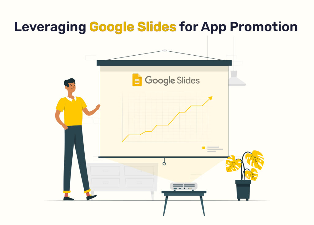
In the competitive world of business app promotion, strategically employing tools is essential. Google Slides, though sometimes underestimated, may be a useful ally in your quest to properly exhibit and market your application.
Dynamic Presentations
Using Google Slides to create visually appealing presentations helps businesses to exhibit their application’s capabilities, success stories, and unique selling points at forums, industry events, and investor meetings. A well-crafted presentation may have a long-lasting impact on potential users and stakeholders.
Comprehensive Training Materials
Google Slides can help you create elaborate training materials. These resources walk users through the application’s complexities, enabling a seamless onboarding experience and transitioning beginners into skilled users.
In-depth Analytics Display
When presenting application data during meetings, using Google Slides gives a professional touch. Charts and graphs make complicated data easier to understand, assisting talks about user engagement, growth metrics, and future initiatives.
Data Visualization Mastery
It takes a skilled creator to turn raw data into visually appealing visuals, and Google displays offers the canvas. Effective data visualization, whether displaying user statistics, market trends, or performance indicators, simplifies complicated information for a wide range of consumers.
Summing up
As we journey through the ever-changing environment of digital entrepreneurship, it becomes clearly evident that the presentation of a business app is the foundation upon which the skeleton of user engagement is built. Recognizing its strategic value goes beyond the bounds of optional considerations.
The design of app presentations plays a function that goes well beyond just aesthetics. It transforms into a planned movement, an intentional move that places itself at the heart of user acquisition. In a digital world when attention is a precious commodity and options abound, your business app’s presentation is a lighthouse that guides users through a busy landscape. Accept the intricacies, handle the expectations, and understand that the clarity of your presentation holds the key to digital resonance and long-term success.
About The Author