Table of Contents
- Discover the Best Color Combinations for Every Presentation Style
- Why Do Colors Matter in a PowerPoint Presentation?
- Understanding Color Psychology in Presentations
- 6 Best PowerPoint Color Palettes for Different Presentation Types
- Understanding Color Schemes and Color Harmony for PowerPoint
- How Many Colors Should You Use in a PowerPoint Presentation?
- PowerPoint Color Palette Guidelines: 7 Rules for Better Slide Design
- Common PowerPoint Color Palette Mistakes to Avoid
- How to Change the Color Scheme in PowerPoint
- Conclusion: Choose the Right PowerPoint Color Palette for Your Next Presentation
PowerPoint Color Palettes: 6 Best Color Schemes for Professional Presentations

Discover the Best Color Combinations for Every Presentation Style
Choosing the right PowerPoint color palettes can make a big difference in how your presentation looks and feels. The right colors help communicate your message, create a strong first impression, improve readability, and keep your slides visually consistent. Whether you’re creating a professional business deck, an educational presentation, a technology pitch, or a creative portfolio, your color scheme should match your topic and audience. In this guide, we’ll explore 6 beautiful PowerPoint color palettes with ready-to-use HEX codes, explain color psychology, and share practical tips to help you choose the perfect colors for your next presentation.
Why Do Colors Matter in a PowerPoint Presentation?
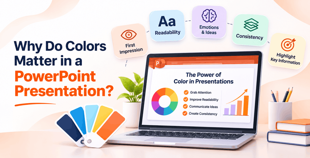
Colors do more than make your slides look attractive. They influence how your audience perceives information, understands your message, and engages with your presentation. A well-chosen color scheme creates visual consistency, highlights important points, and makes complex information easier to follow.
Here are five reasons why choosing the right presentation colors matters.
1. Create a Strong First Impression
Your presentation’s colors are among the first things your audience notices. Professional color combinations make your slides look polished, organized, and visually appealing. For business presentations, shades of navy, blue, and white can create a sense of professionalism and trust.
2. Improve Readability and Clarity
The right contrast between backgrounds and text makes your content easier to read. For example, dark text on a light background or white text on a dark background helps important information stand out. Avoid combinations that make text difficult to distinguish.
3. Communicate Emotions and Ideas
Different colors can create different visual impressions. Blue often communicates trust and stability, green is commonly associated with growth and nature, while orange can suggest energy and enthusiasm. Choosing colors that complement your presentation topic helps reinforce its message.
4. Maintain Visual Consistency
Using a consistent color palette across your slides makes the entire presentation feel connected. Assign specific colors to headings, backgrounds, charts, icons, and highlights instead of introducing random colors on every slide.
5. Highlight Important Information
Strategic use of accent colors helps draw attention to key statistics, important messages, charts, and calls to action. A contrasting accent color can guide your audience toward the information you want them to remember.
Pro Tip: Limit your presentation to a small, coordinated palette and maintain sufficient contrast between text and backgrounds. A consistent color scheme makes even information-heavy slides easier to understand.
Understanding Color Psychology in Presentations
Colors can influence how people perceive information and respond to visual content. In presentation design, choosing the right colors helps establish the mood, communicate ideas, and reinforce the message you want your audience to remember. While color associations can vary across cultures and contexts, certain colors are commonly used to communicate specific feelings and ideas.
Here are some popular colors and how you can use them in your PowerPoint presentations.
1. Blue – Trust and Professionalism
Blue is commonly associated with trust, stability, confidence, and reliability. It is a popular choice for business presentations because it creates a professional and organized appearance.
Best for: Corporate presentations, financial reports, business proposals, technology decks, and company profiles.
2. Red – Energy and Urgency
Red is a bold and attention-grabbing color that communicates energy, excitement, passion, and urgency. Use it strategically to highlight important statistics, warnings, key takeaways, or calls to action.
Best for: Marketing presentations, sales pitches, product launches, and campaign presentations.
3. Green – Growth and Balance
Green is often associated with nature, growth, health, sustainability, and balance. It works particularly well in presentations that discuss progress, environmental initiatives, financial growth, or wellness.
Best for: Sustainability presentations, healthcare decks, financial reports, and environmental projects.
4. Yellow – Optimism and Creativity
Yellow represents optimism, happiness, creativity, and positivity. Its brightness makes it useful for drawing attention to important information, although excessive use can make slides visually overwhelming.
Best for: Educational presentations, creative projects, marketing campaigns, and brainstorming sessions.
5. Purple – Creativity and Sophistication
Purple is often associated with creativity, imagination, luxury, and innovation. It can give presentations a distinctive and modern appearance, especially when paired with neutral backgrounds.
Best for: Creative portfolios, branding presentations, luxury products, and innovation-focused decks.
6. Orange – Enthusiasm and Energy
Orange combines the warmth of red with the cheerful appearance of yellow. It creates an energetic and approachable visual style, making it useful for highlighting important elements without relying entirely on bold red.
Best for: Marketing presentations, startup pitches, business proposals, and creative presentations.
7. Black and White – Simplicity and Authority
Black and white create a timeless, minimalist appearance. Black communicates sophistication and authority, while white creates a sense of simplicity, openness, and clarity. Together, they provide a strong foundation for clean presentation layouts.
Best for: Executive presentations, portfolios, professional reports, and minimalist business decks.
Design Tip: Don’t choose presentation colors based on psychology alone. Consider your topic, audience, brand identity, and readability. Use accent colors strategically and maintain sufficient contrast between text and backgrounds.
6 Best PowerPoint Color Palettes for Different Presentation Types
Choosing the right PowerPoint color palette depends on your presentation’s purpose, audience, and overall design style. A corporate presentation may need professional blues and orange accents, while an educational deck can benefit from cheerful pastel shades. Similarly, technology presentations often use dark backgrounds with neon highlights to create a futuristic look.
Here are six PowerPoint color palettes for different presentation types, along with ready-to-use HEX codes, recommended applications, and real SlideChef template examples.
1. Corporate Blue and Orange – Professional and Modern

VIEW HERE : Corporate Strategy Template
Blue and orange make an effective combination for corporate presentations. Blue communicates professionalism, stability, and trust, while orange adds energy and draws attention to important information. Together, they create a balanced business presentation that looks professional without feeling too formal.
Recommended Color Palette:
- Deep Blue:
#17365D - Corporate Blue:
#2878B5 - Light Blue:
#8AB9D6 - White:
#FFFFFF - Vibrant Orange:
#F36F3D
Best For: Corporate presentations, business strategies, company profiles, business proposals, and executive meetings.
Design Tip: Use white as your primary background, deep blue for headings, and corporate blue for charts and diagrams. Apply orange to important statistics, icons, and key highlights to create visual contrast.
2. Modern Technology – Dark, Futuristic, and Innovative

VIEW HERE : 6G Technology Presentation Template
Technology presentations often use dark backgrounds with glowing blue, purple, and magenta accents. This combination creates a futuristic atmosphere and works particularly well for topics involving artificial intelligence, emerging technologies, and digital transformation.
Recommended Color Palette:
- Deep Black:
#090B16 - Dark Navy:
#151B3B - Electric Blue:
#397BFF - Violet:
#884DFF - Magenta:
#E34BCE
Best For: AI presentations, technology startups, software demonstrations, telecommunications, digital transformation, and innovation projects.
Design Tip: Use black or dark navy for backgrounds and white for primary text. Apply electric blue and violet to diagrams, icons, and visual elements. Use magenta sparingly for important highlights and glowing effects.
3. Education and Learning – Colorful, Friendly, and Engaging

VIEW HERE : Welcome to our class template
Educational presentations benefit from cheerful colors that make learning materials more inviting and easier to explore. Pastel shades such as pink, lavender, mint green, baby blue, and golden yellow create a playful atmosphere while keeping the overall design visually balanced.
Recommended Color Palette:
- Cream:
#FFF8E9 - Pastel Pink:
#F5B5CF - Lavender:
#C9B8F0 - Mint Green:
#A9DCC5 - Golden Yellow:
#F4D36B
Best For: Classroom presentations, student projects, teacher introductions, school activities, educational workshops, and learning materials.
Design Tip: Use cream or white as your primary background and pastel shades for content cards, diagrams, illustrations, and section headings. Combine different colors to organize topics and make educational information more engaging.
4. Finance and Executive – Professional Teal and Navy

VIEW HERE : Financial Report Template
Financial presentations need a color scheme that communicates trust, clarity, and professionalism. Teal and navy blue create a sophisticated combination that works especially well for reports, dashboards, financial charts, and business performance reviews.
Recommended Color Palette:
- Deep Navy:
#102A43 - Dark Teal:
#126E75 - Teal:
#2A9D98 - Light Gray:
#F1F5F7 - White:
#FFFFFF
Best For: Financial reports, investment proposals, budget presentations, annual reports, business performance reviews, and executive meetings.
Design Tip: Use white or light gray backgrounds for data-heavy slides. Apply navy to headings and section dividers, while teal works well for charts, graphs, and KPI highlights. Maintain consistent colors across financial dashboards to make comparisons easier.
5. Healthcare and Medical – Clean Blue and Orange

VIEW HERE : Medical Report Template
Healthcare presentations benefit from clean, professional colors that communicate clarity and reliability. Blue is commonly associated with trust and confidence, while orange adds warmth and helps important information stand out. Combining these shades with white creates a balanced visual style for medical and healthcare-related content.
Recommended Color Palette:
- Deep Blue:
#173B63 - Medical Blue:
#347DB5 - Light Blue:
#9CC9E5 - White:
#FFFFFF - Soft Orange:
#F29A65
Best For: Medical presentations, healthcare reports, hospital management, pharmaceutical presentations, medical research, and public health awareness.
Design Tip: Use white as your main background and blue for headings, charts, and medical diagrams. Introduce orange as an accent for key statistics, important findings, and highlighted information. Avoid excessive decoration to keep medical content clear and easy to understand.
6. Creative and Marketing – Elegant Purple and Violet

VIEW HERE : Purple Aesthetic Template
Purple is a popular choice for creative presentations because it creates a distinctive and sophisticated visual identity. Different shades of purple, combined with subtle gradients and clean typography, can make marketing presentations, portfolios, and brand pitches look modern and memorable.
Recommended Color Palette:
- Deep Purple:
#241332 - Royal Purple:
#58358C - Violet:
#8956C8 - Light Lavender:
#C5A9E8 - White:
#FFFFFF
Best For: Marketing presentations, creative portfolios, brand strategies, advertising campaigns, product launches, and startup pitches.
Design Tip: Use deep purple for cover slides and section dividers. Combine violet and lavender in content cards, diagrams, and background gradients. Use white typography to maintain readability and create a clean contrast.
Quick Tip: These PowerPoint color palettes are starting points, not strict rules. You can adjust individual shades to match your brand identity, presentation topic, or personal design preferences. Always check text contrast and maintain consistency across your slides for a professional result.
Understanding Color Schemes and Color Harmony for PowerPoint
Choosing colors that look good together is an important part of presentation design. Color harmony refers to how different colors work together to create a balanced and visually appealing combination. Understanding basic color schemes can help you select suitable colors for backgrounds, headings, charts, icons, and other slide elements.
The color wheel is a useful tool for exploring these combinations. Here are five popular color schemes you can use when designing PowerPoint presentations.
1. Monochromatic Color Scheme
A monochromatic color scheme uses different shades, tints, and tones of a single color. For example, a blue palette can include deep navy, medium blue, sky blue, and pale blue.
This approach creates a clean, consistent appearance without introducing too many contrasting colors.
Example: #14213D, #1F4E79, #6FA3C8, #B9D6E8, #EAF3F8
Best For: Corporate presentations, annual reports, business proposals, and minimalist slide designs.
Design Tip: Use darker shades for headings and important elements, while lighter shades work well for backgrounds, content cards, and supporting graphics.
2. Analogous Color Scheme
An analogous color scheme combines three or more colors that sit next to each other on the color wheel. These colors share similar visual characteristics and usually create a smooth, harmonious appearance.
For example, blue, blue-green, and green can create a refreshing combination suitable for nature-inspired or technology-related presentations.
Example: #1D4ED8, #0D9488, #16A34A, #86CFA1
Best For: Environmental presentations, healthcare topics, educational slides, and creative projects.
Design Tip: Choose one dominant color and use the remaining shades as supporting colors. This prevents the presentation from looking too colorful or unorganized.
3. Complementary Color Scheme
A complementary color scheme combines two colors positioned opposite each other on the color wheel. Popular examples include blue and orange, red and green, and purple and yellow.
These combinations create strong contrast, making them useful for highlighting important information and creating visually striking slides.
Example: #1F4E79, #F28C28, #DCEAF4, #FFFFFF
Best For: Marketing presentations, sales pitches, product launches, and business proposals.
Design Tip: Use one color as the dominant shade and reserve its complementary color for highlights, charts, icons, and important statistics. Avoid using both colors at equal intensity across the entire slide.
4. Triadic Color Scheme
A triadic color scheme uses three colors that are evenly spaced around the color wheel. This creates a vibrant combination with a good balance of color variety.
For example, blue, red, and yellow form a classic triadic combination. You can also experiment with softer versions of these colors for a more modern presentation style.
Example: #2563EB, #E45757, #F4C95D, #F8F9FA
Best For: Educational presentations, creative portfolios, marketing campaigns, and infographic designs.
Design Tip: Select one dominant color and use the other two as accents. Adjust their brightness and saturation to keep the slides visually balanced.
5. Split-Complementary Color Scheme
A split-complementary color scheme uses one dominant color and two colors positioned on either side of its complementary color. It provides strong visual contrast while offering more flexibility than a traditional complementary scheme.
For example, blue can be paired with yellow-orange and red-orange to create a dynamic but balanced palette.
Example: #2563EB, #F4B942, #EF8354, #F5F7FA
Best For: Business presentations, creative projects, marketing decks, and product presentations.
Design Tip: Use the primary color for headings and major visual elements, while the two supporting colors can highlight charts, icons, and important information.
How to Choose the Right Color Harmony
Each color scheme creates a different visual effect. Your choice should depend on the presentation’s purpose and the type of content you’re communicating.
| Color scheme | Visual effect | Best application |
|---|---|---|
| Monochromatic | Clean and consistent | Corporate decks |
| Analogous | Smooth and harmonious | Healthcare and nature |
| Complementary | Bold and contrasting | Marketing and sales |
| Triadic | Vibrant and balanced | Education and creative |
| Split-complementary | Dynamic and flexible | Business and product decks |
Design Tip: You don’t need to use complex color combinations to create attractive slides. Start with a simple color scheme, establish one dominant color, and introduce supporting shades only where they add value. Always prioritize readability and visual consistency.
How Many Colors Should You Use in a PowerPoint Presentation?
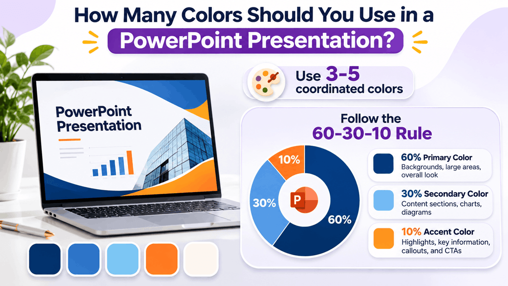
Using too many colors in a presentation can make your slides look cluttered and distract your audience from the main message. On the other hand, using too few colors may make your slides feel flat and monotonous. The key is to find the right balance between your primary, secondary, and accent colors.
As a general design guideline, using 3–5 coordinated colors is a good starting point for most PowerPoint presentations. The 60-30-10 rule is another useful approach to distributing these colors across your slides.
1. Understand the 60-30-10 Color Rule
The 60-30-10 rule is a popular design principle that divides colors into three proportions to create a balanced visual appearance.
Here’s how it works:
- 60% – Primary Color: The dominant color that establishes the overall appearance of your slides. It is commonly used for backgrounds and large visual areas.
- 30% – Secondary Color: A supporting color that creates contrast and adds variety. Use it for content sections, charts, diagrams, and supporting elements.
- 10% – Accent Color: A highlight color used sparingly to draw attention to important information, statistics, icons, and calls to action.
For example, a corporate presentation might use white as its primary color, navy blue as its secondary color, and orange as its accent color.
2. Choose a Primary Color
Your primary color establishes the visual identity of your presentation. It should complement your topic, brand identity, and overall design style.
For example:
- Navy blue for professional business presentations.
- Black for modern technology presentations.
- Cream for educational presentations.
- White for healthcare and medical presentations.
- Deep purple for creative and marketing presentations.
Use your primary color consistently across backgrounds, headings, and major design elements.
3. Add Secondary Colors for Visual Balance
Secondary colors support your primary color and help organize different sections of your presentation. They are particularly useful for content cards, charts, diagrams, illustrations, and section dividers.
For example, if navy blue is your primary color, lighter blue shades or soft gray can work as supporting colors.
Choose secondary shades that complement your primary color rather than competing with it.
4. Use Accent Colors to Highlight Important Information
Accent colors should be used selectively to draw attention to specific elements. They help your audience identify important statistics, key findings, highlighted statements, and calls to action.
For example, orange works well as an accent in a blue corporate presentation, while yellow can add emphasis to a purple creative presentation.
Avoid using accent colors for large background areas or every element on a slide. Their purpose is to make selected information stand out.
5. Maintain the Same Color Distribution Across Slides
Once you select your presentation palette, apply it consistently throughout the deck. Use the same colors for headings, backgrounds, charts, icons, and other recurring elements.
For example, if blue represents primary headings on your first slide, maintain that visual treatment throughout the presentation. You can introduce different shades for charts and diagrams without changing the overall color identity.
Design Tip: The 60-30-10 rule is a flexible guideline, not a strict requirement. Some presentations may need more neutral space or additional colors for complex charts. Focus on maintaining a clear visual hierarchy, sufficient contrast, and a consistent design language.
PowerPoint Color Palette Guidelines: 7 Rules for Better Slide Design
Choosing a beautiful color palette is important, but applying it correctly across your slides is equally essential. Even the best color combinations can look unprofessional when there is poor contrast, inconsistent styling, or excessive use of bright shades.
Follow these seven practical guidelines to create balanced, readable, and visually appealing PowerPoint presentations.
1. Maintain Strong Contrast Between Text and Backgrounds
Text should always be easy to read against its background. Use dark text on light backgrounds or white text on darker backgrounds to create clear visual contrast.
For example, navy text on a white background works well for business presentations, while white text on a deep purple background can create a striking look for creative presentations.
Avoid placing light-colored text on pale backgrounds or dark text on similarly dark shades.
2. Avoid Using Too Many Bright Colors
Using several bright colors on the same slide can make your presentation look cluttered and distract your audience. Instead, select one dominant color and introduce a few complementary shades for supporting elements.
For example, if you’re using blue as your primary color, add light blue and white for balance, with orange as a limited accent color.
3. Choose Background Colors That Support Your Content
Your background color should make your content stand out rather than compete for attention.
White, cream, and light gray are useful for information-heavy presentations because they provide a clean reading experience. Dark navy, charcoal, and deep purple can work well for technology presentations, creative decks, and section divider slides.
Choose a background that complements your text, images, and presentation environment.
4. Maintain Consistent Colors Across All Slides
A professional presentation should have a consistent visual identity from the opening slide to the conclusion.
Use the same colors for recurring elements such as headings, section titles, icons, charts, and highlighted information. Avoid introducing unrelated colors on individual slides unless they serve a clear purpose.
You can also save your selected colors as a custom PowerPoint theme to maintain consistency throughout the deck.
5. Use Accent Colors Strategically
Accent colors help draw attention to the most important parts of your presentation. Use them to highlight key statistics, important findings, chart values, icons, and calls to action.
For example, a corporate presentation with navy and white as its primary colors can use orange to highlight revenue growth or important business metrics.
Remember that accent colors are most effective when used selectively.
6. Consider Color Accessibility
Not every audience member perceives colors in the same way. Some people experience color vision deficiencies, which can make certain color combinations difficult to distinguish.
Avoid relying only on red and green to communicate positive and negative results. Instead, combine colors with labels, icons, symbols, or patterns.
For text readability, follow these WCAG contrast guidelines:
- Normal-sized text: Minimum contrast ratio of 4.5:1.
- Large text: Minimum contrast ratio of 3:1.
These checks help make your presentation more accessible and easier to understand.
7. Test Your Colors on Different Screens
Colors can appear different depending on screen brightness, display settings, and projector quality. A combination that looks excellent on your laptop may appear washed out when projected in a bright conference room.
Before presenting, preview your slides on the screen or projector you plan to use. Check whether headings, charts, labels, and other important elements remain clearly visible.
Design Tip: A successful PowerPoint color scheme should support your message, not compete with it. Keep your palette consistent, use accent colors thoughtfully, and prioritize readability over decoration.
Common PowerPoint Color Palette Mistakes to Avoid
Choosing the right colors can improve the appearance of your presentation, but using them incorrectly can make even a well-designed slide look unprofessional. Poor color combinations, inconsistent styling, and insufficient contrast can affect readability and distract your audience from the main message.
Here are six common PowerPoint color palette mistakes to avoid when designing your slides.
1. Using Too Many Colors on One Slide
Introducing too many unrelated colors can make your slides look cluttered and visually confusing. It also becomes difficult for your audience to identify important information.
How to avoid it: Stick to a coordinated palette of around 3–5 colors. Assign specific roles to your primary, secondary, and accent colors, and use them consistently throughout your presentation.
2. Choosing Colors With Poor Contrast
Using similar shades for text and backgrounds makes information difficult to read. For example, light gray text on a white background or dark blue text on a black background can strain your audience’s eyes.
How to avoid it: Choose contrasting foreground and background colors. Test your text against different backgrounds and check accessibility contrast ratios before finalizing your slides.
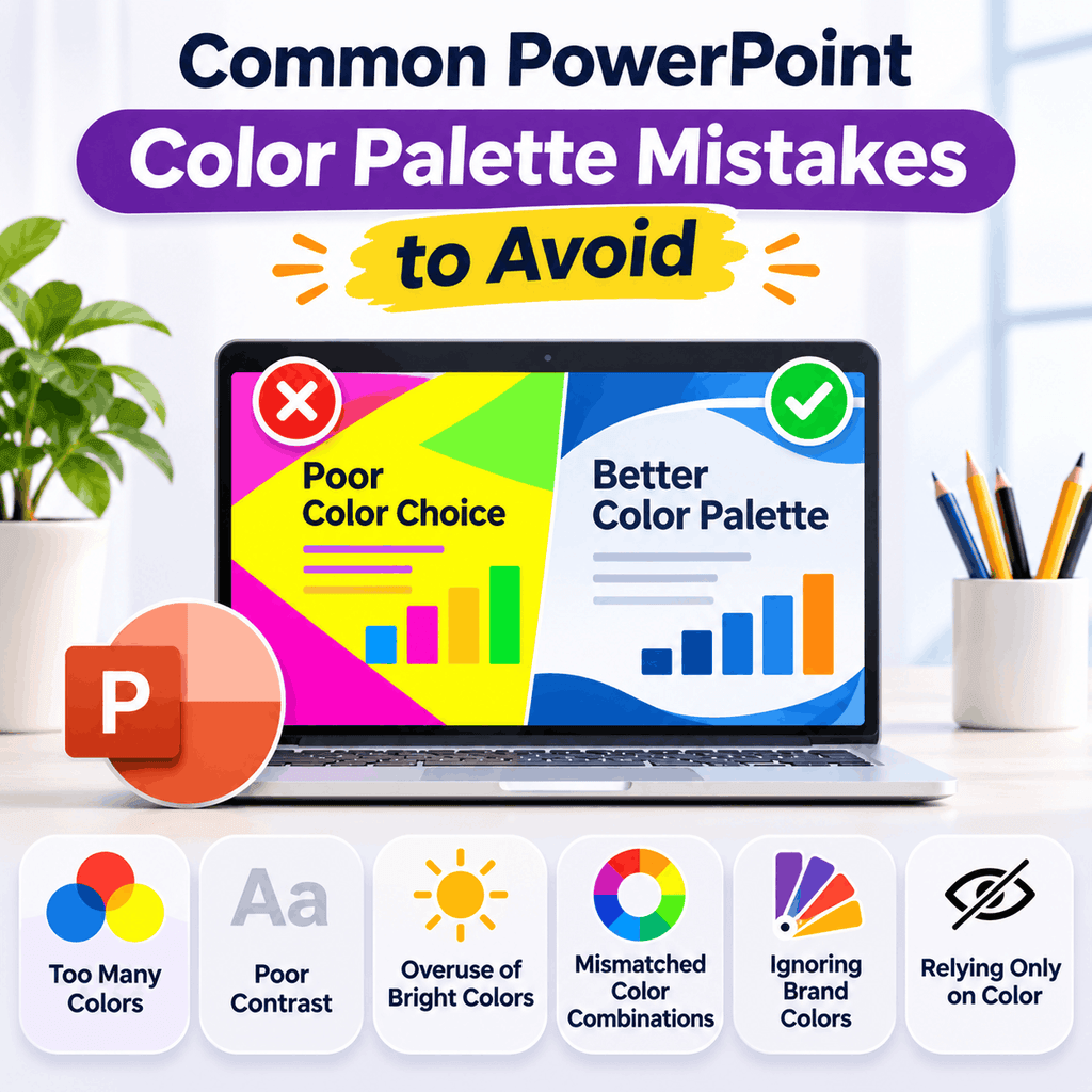
3. Using Bright Colors Everywhere
Bright colors such as neon green, vibrant red, and electric yellow can attract attention, but using them excessively can make your presentation overwhelming.
How to avoid it: Use bright shades selectively for important statistics, icons, charts, and highlights. Balance them with neutral backgrounds and softer supporting colors.
4. Mixing Colors That Don’t Work Together
Not every attractive color looks good when combined with another. Randomly mixing unrelated shades can create an inconsistent visual appearance and weaken your presentation’s overall design.
How to avoid it: Use established color harmony principles such as complementary, analogous, monochromatic, or triadic combinations. A color wheel can help you identify shades that work well together.
5. Ignoring Brand Identity
Using colors that don’t match your company’s visual identity can make business presentations feel disconnected from your website, logo, and marketing materials.
How to avoid it: Start with your existing brand colors and build a complementary presentation palette around them. Use your primary brand color for headings or important elements and introduce neutral shades to maintain balance.
6. Using Color as the Only Way to Communicate Information
Relying entirely on colors to explain charts, diagrams, or statistics can create accessibility problems. For example, someone with red-green color vision deficiency may struggle to distinguish between two data categories.
How to avoid it: Combine colors with labels, icons, symbols, patterns, or direct data values. This makes your slides easier to understand for a wider audience.
Design Tip: Before finalizing your presentation, review a few slides together rather than checking each slide individually. Look for consistent colors, readable text, balanced backgrounds, and clear visual hierarchy. A coordinated presentation should feel like one complete design rather than a collection of unrelated slides.
How to Change the Color Scheme in PowerPoint
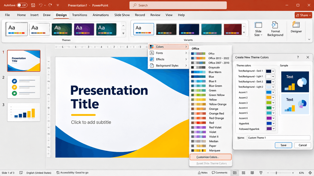
Once you’ve selected the perfect color palette, the next step is applying it to your presentation. Microsoft PowerPoint allows you to customize theme colors, replace default shades, and create a consistent visual style across all your slides.
You can use built-in color themes or enter your own HEX codes to match your preferred palette. Follow these steps to customize your PowerPoint color scheme.
1. Open the Design Tab
Open your PowerPoint presentation and navigate to the Design tab in the top menu. Here, you’ll find different themes and design variations that you can apply to your slides.
Choose a theme that provides a suitable starting point for your presentation.
2. Explore the Available Theme Colors
Under the Design tab, locate the Variants section. Open its dropdown menu and select Colors.
PowerPoint provides several built-in color combinations that automatically coordinate headings, backgrounds, accents, and other presentation elements.
Browse the available options and select a combination that suits your presentation style.
3. Customize Your Theme Colors
If the default color combinations don’t match your requirements, you can create your own theme.
Select Customize Colors from the Colors menu. A dialog box will appear with options for changing:
- Text and Background colors
- Accent Colors
- Hyperlink colors
- Followed Hyperlink colors
Choose the shades you want for each element to create a coordinated presentation palette.
4. Enter Custom HEX Color Codes
If you already have a color palette, you can enter its HEX codes directly into PowerPoint.
To do this:
- Select the element you want to customize, such as a shape, text box, or background.
- Open the Shape Fill, Font Color, or relevant color menu.
- Select More Colors.
- Open the Custom color option.
- Enter your HEX code in the designated field.
- Click OK to apply the color.
Repeat these steps for the other colors in your palette.
5. Save Your Custom Color Theme
After customizing your colors, give your theme a recognizable name and save it. Your new color combination will be available for reuse in your presentation and can help maintain consistency across future slides.
You can also save the presentation as a PowerPoint template file (.potx) if you want to reuse the overall slide design and formatting.
Design Tip: Before applying your color palette to every slide, test it on a cover slide, content slide, chart, and section divider. This helps you identify contrast and readability issues early and ensures that your chosen colors work across different presentation layouts.
Conclusion: Choose the Right PowerPoint Color Palette for Your Next Presentation
The right PowerPoint color palette can transform an ordinary presentation into a visually engaging and professional experience. From corporate blues and futuristic technology shades to playful pastels and elegant purple combinations, your color choices influence how your audience perceives and interacts with your slides.
As you design your next presentation, consider your topic, audience, and brand identity before selecting a color scheme. Use a balanced combination of primary, secondary, and accent colors, maintain sufficient contrast, and apply your palette consistently across every slide.
If you want to save time designing your slides, explore SlideChef’s PowerPoint Presentation Templates. Discover professionally designed, editable presentation templates for business, education, technology, marketing, and more. Customize the colors, fonts, and layouts to create presentations that match your style and communicate your ideas effectively.
Remember: Great presentation design isn’t about using more colors; it’s about choosing the right colors and using them effectively.
About The Author





Related Blogs